Perfume Branding - 5 Examples of the Minimalism Aesthetic
The minimalist aesthetic requires a strong creative direction in order to convey luxury and uniqueness without looking cheap and like stock perfume packaging. This aesthetic was first popularized in the Nordic countries of Europe and has given birth to an entire design category that is implemented worldwide. Minimalism can be defined as the use of hard edges, linear lines, simple forms, and the use of solid colors that are often muted. The aesthetic focuses on simplicity and utility over expressionism and exuberant design elements.
Minimalism has found a home in the perfume industry for a number of reasons, one of which is it can dramatically reduce the need for expensive bottle designs. The aesthetic has an entire subculture of people who adhere to a minimalist design style in their home furnishing and consumption habits. There are thousands of blogs, social media accounts, and lifestyle brands dedicated to this aesthetic. Any perfume brand that can successfully navigate this type of aesthetic with captivating art direction will be able to leverage a large niche audience that has a special conenction to this aesthetic and lifestyle.
Lets look at 5 perfume brands that lean heavily into the minimalism brand identity.
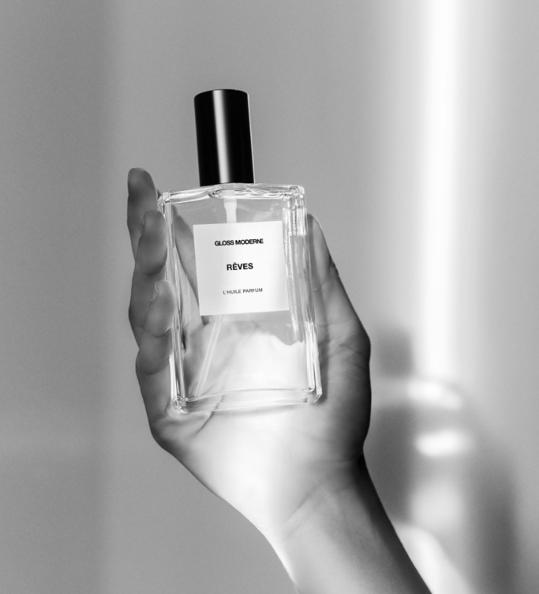
Gloss Moderne
This brand was created in southern California and uses a black, white, and grey color palette expertly. It has both product and lifestyle shots that incorporate shadows through broad lighting and split lighting. The aesthetic is clean without feeling overly sanitized.
Hiram Green
This perfume brand is based in the Netherlands and features minimalist-style packaging. The bottles have a hot stamped lettering instead of a label in order to keep the attention on the bottle’s unique form and the bright coloring of the perfume liquid. The wooden cap is tall but simple in presentation and complements the bottle design by balancing out the roundness of the bottle.
Miller Harris
British fragrance house Miller Harris uses a minimalist design and soft pastel color palette to bring attention to understated design elements. The labeling is simple with gold lettering that matches a gold cap. A very balanced presentation that is refined and subtle.
Le Galion
This perfume brand originating from Paris, France has a minimalist black and white label with an ordinary typeface in order to draw attention to the fluted glass bottle design. Their photography often incorporates bright lighting with the perfume positioned on glossy or reflective surfaces to provide contrast to the composition.
Jorum Studio
This brand originating from Scotland uses taller sleek bottles and small black caps with uniform label sizes across all of its perfume lines in order to emphasize the various typefaces they use. Some of their perfumes also feature asymmetric label designs and lettering which helps the perfume naturally standout in retail displays without trying too hard.


